
Have you ever wondered, “Where Is The Nearest National Park?” It’s a question that sparks curiosity and a desire to explore the great outdoors. America’s National Parks are treasures, offering breathtaking landscapes, diverse ecosystems, and a chance to connect with nature. Knowing where the closest one is can be the first step to planning an unforgettable adventure. This article will guide you through creating a map that not only answers this question but also delves into the demographics of the communities surrounding these natural wonders.
Understanding National Parks and Proximity
National Parks are more than just pretty scenery; they are protected areas of natural beauty, historical significance, or ecological importance. From the towering granite cliffs of Yosemite to the vast wilderness of Denali, each park offers a unique experience. People visit National Parks for recreation, inspiration, and education, seeking escape and connection with the natural world.
When we ask, “Where is the nearest National Park?”, we’re often thinking about geographical proximity. But “nearest” can be interpreted in different ways. Is it the closest in straight-line distance? Or the quickest to drive to? For the purpose of this exploration, we’ll consider “nearest” in terms of area of influence. Imagine each National Park radiating outwards, claiming the land closest to it. This concept can be visually represented using Thiessen polygons, a powerful tool in Geographic Information Systems (GIS).
Mapping National Parks: A Step-by-Step Guide Using GIS
Creating a map to visualize “where is the nearest National Park” is not just a fun project; it’s a practical application of GIS technology. We’ll use ArcGIS Pro, a leading GIS software, to build this map. This guide will walk you through the process, combining spatial analysis with cartographic design to produce an informative and visually appealing map.
The core idea is to use Thiessen polygons (also known as Voronoi polygons) to define the area of influence around each National Park. Then, we’ll enrich this map with demographic data to understand the communities living near these parks. Finally, we’ll draw inspiration from vintage National Park posters to give our map a classic, engaging aesthetic.
Here’s a brief overview of the steps we’ll cover:
- Gathering Data: Collecting the necessary geographic data layers, including National Park locations, state boundaries, and populated places.
- Creating Thiessen Polygons: Using ArcGIS Pro to generate Thiessen polygons, defining the area closest to each National Park.
- Enriching Data: Adding demographic information to the Thiessen polygons to understand the surrounding communities.
- Vintage Map Design: Applying design techniques inspired by vintage WPA National Park posters to enhance the map’s visual appeal.
Let’s dive into each step and create our “Where is the Nearest National Park?” map.
Gathering Your Data: Essential Layers for National Park Mapping
To start mapping, we need the right geographic data. For this project, we’ll use several key layers, all readily available:
-
US State Boundaries: This layer provides the political context for our map, outlining the states within the United States. You can access this data from ArcGIS Living Atlas, a vast repository of geographic information.
-
Administrative Boundaries of National Park System Units: This dataset from the National Park Service (NPS) provides the boundaries of all National Park System units. We’ll specifically extract the “National Parks” and convert their polygon representations into points, which are necessary for creating Thiessen polygons. The Feature to Point tool in ArcGIS Pro will handle this conversion.
-
US Census Populated Places: This layer, also available through ArcGIS Living Atlas, shows the locations of populated places (cities and towns) across the US. We’ll use a selection of major cities to provide geographic reference on our map.
-
Natural Earth Hydrography: To add geographic context and visual richness, we’ll incorporate hydrography data from Natural Earth, a public domain map dataset. We’ll use layers for rivers, lakes, and reservoirs to represent water features.
These layers, when combined, will provide the geographic foundation for our map. You can add these layers to your ArcGIS Pro project using the “Add Data from Path” option and by connecting to ArcGIS Online or local file paths.
 US State Boundaries Layer
Creating Thiessen Polygons: Defining the ‘Nearest’ Park Area
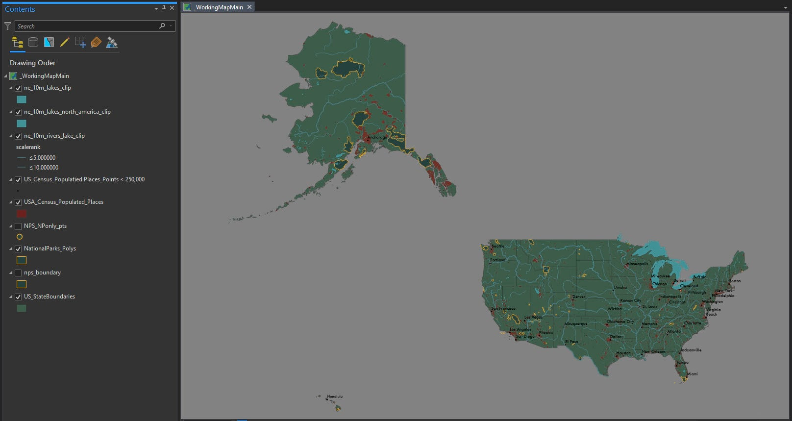
Now for the core spatial analysis: creating Thiessen polygons. The Thiessen Polygons tool in ArcGIS Pro is designed precisely for this purpose. It calculates the area of influence around each input point feature – in our case, each National Park point.
The tool works by dividing the space around the National Parks into zones. Every location within a Thiessen polygon is closer to its associated National Park than to any other park. Imagine drawing lines exactly halfway between each pair of National Parks; these lines form the boundaries of the Thiessen polygons. The result is a mosaic of polygons, each representing the “nearest” area to a specific National Park.
To use the tool in ArcGIS Pro:
- Navigate to the Analysis tab and open the Tools pane.
- Search for “Thiessen Polygons” or “Create Thiessen Polygons.”
- Input Features: Select the point layer you created from the National Park polygons.
- Output Feature Class: Specify a name and location for the output Thiessen polygon layer.
- Run the tool.
The output will be a polygon layer where each polygon encloses the area “nearest” to a particular National Park. Visually, Thiessen polygons are striking, resembling the intricate geometry of a spiderweb.
 Thiessen Polygons around National Parks
Important Note: Thiessen polygons have a caveat. They define proximity based solely on geographic distance, ignoring real-world factors like travel time, road networks, or natural barriers. For instance, a location within a Thiessen polygon might be geographically closest to a particular park but practically much harder to access than a slightly further park. It’s crucial to include this disclaimer when presenting your map.
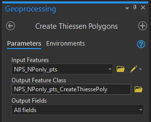
To enhance the visual clarity of the Thiessen polygons, consider converting them to polylines using the Feature to Line tool. This allows you to symbolize the boundaries with dotted lines, creating a cleaner and more cartographically appealing effect.
 Thiessen Polygons converted to dotted polylines
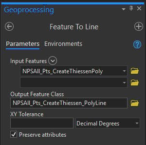
Enriching Your Map: Adding Demographic Context
To make our map more insightful, we can enrich it with demographic data. The Enrich tool in ArcGIS Pro allows you to add demographic and socioeconomic information to your geographic features. In our case, we’ll enrich the Thiessen polygons with data about the people living within these “nearest park” areas.
This step requires an ArcGIS Online organizational account as it utilizes ArcGIS Online services to access demographic data. The Enrich tool works by querying a vast database of demographic information and appending relevant attributes to your feature layer.
Here’s how to enrich your Thiessen polygons:
- In ArcGIS Pro, under the Analysis tab, open the Enrich tool.
- Input Features: Select your Thiessen polygon layer.
- Output Feature Class: Name your output enriched layer.
- Click “Variables” to choose demographic data categories.
For this map, let’s focus on demographic indicators that might relate to park visitation and accessibility:
- Total Population: How many people live within each “nearest park” area?
- Total Households: How many households are there?
- Households with Income Below Poverty Level: What is the poverty rate in these areas?
- Owner Households by Vehicles Available: 0: How many households lack access to a car?
These variables can provide insights into the communities living around National Parks and potential barriers they might face in visiting them. For example, areas with higher poverty rates or lower vehicle ownership might have less access to National Parks, even if they are geographically “nearest.”
 Enrich Tool in ArcGIS Pro
After running the Enrich tool, open the attribute table of your enriched Thiessen polygon layer. You’ll see new fields containing the demographic data you selected, linked to each National Park’s area of influence. Analyzing this data can reveal interesting patterns and relationships between demographics and proximity to National Parks.
Vintage Map Design: Inspired by WPA National Park Posters
To enhance the visual appeal of our map, we’ll take inspiration from the iconic vintage National Park posters created by the Works Progress Administration (WPA) in the 1930s and 40s. These posters are known for their bold colors, stylized landscapes, and a distinctive “cutout effect.”
The WPA posters were part of a Federal Art Project during the Great Depression, employing artists to create public art. The National Park posters are now celebrated as classic examples of American graphic design, evoking a sense of nostalgia and the beauty of the parks.
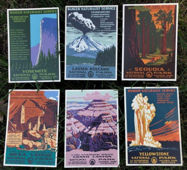 Vintage WPA National Park Posters
Our goal is to emulate this vintage aesthetic in our “Where is the Nearest National Park?” map, particularly the “cutout effect” which gives the posters a layered, graphic look.
Achieving the Cutout Effect: A Design Sidestep
To achieve the cutout effect, we’ll take a brief “sidestep” out of ArcGIS Pro and use graphic design software like Adobe Photoshop (or similar). The process involves exporting a basemap from ArcGIS Pro, applying a cutout filter in Photoshop, and then georeferencing the modified image back into ArcGIS Pro.
Here are the steps:
-
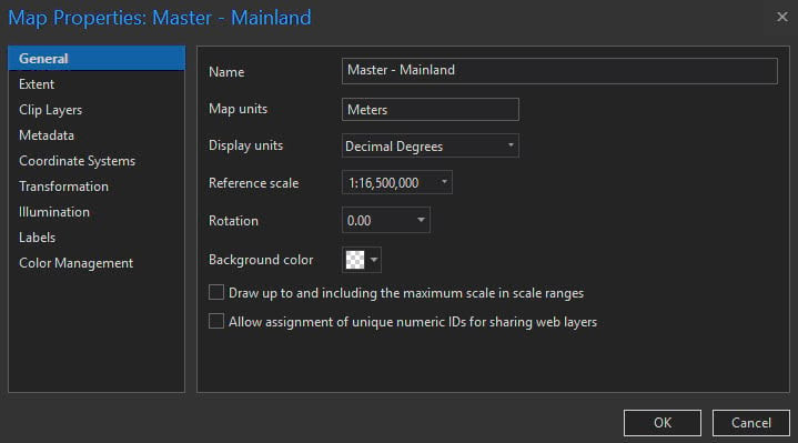
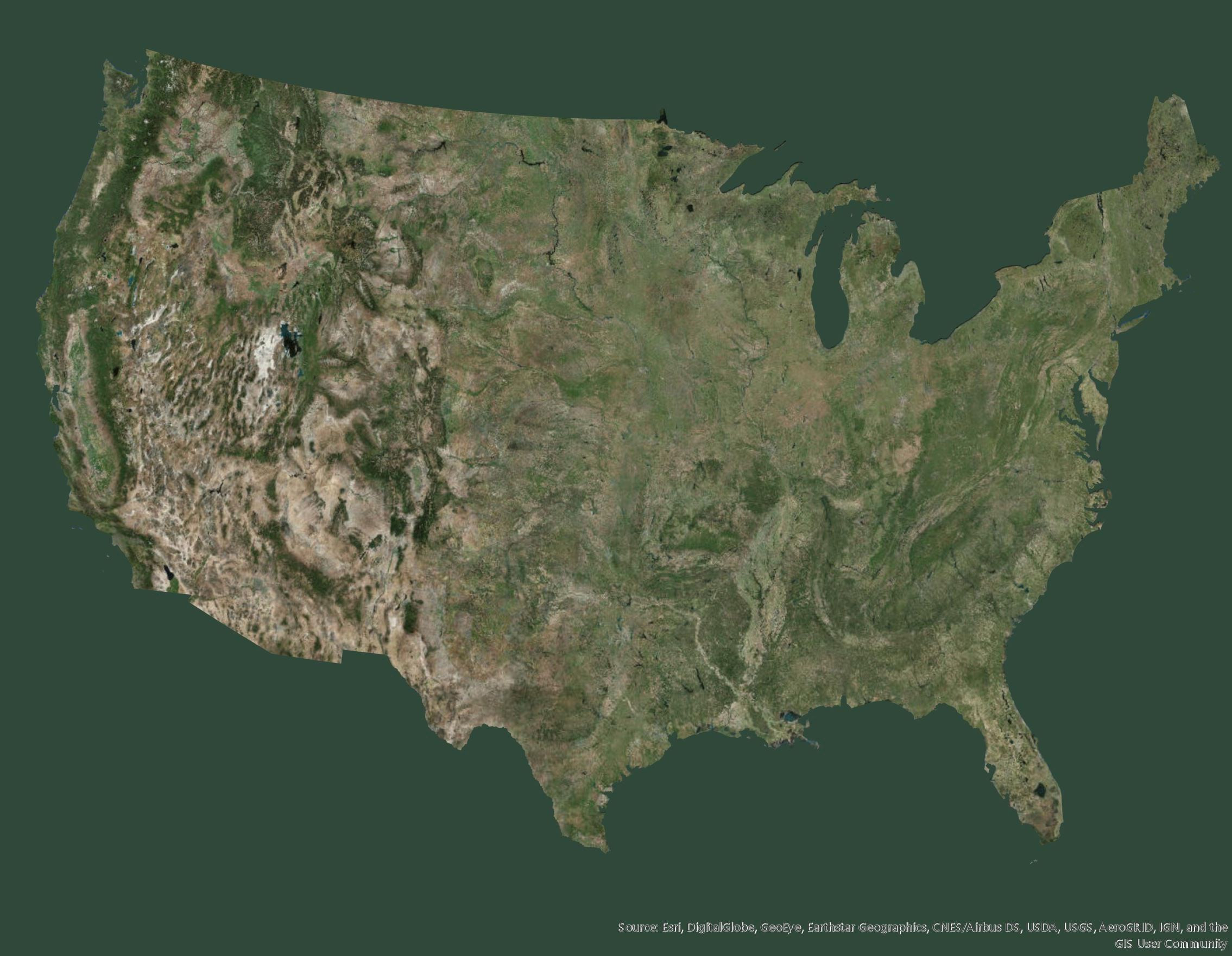
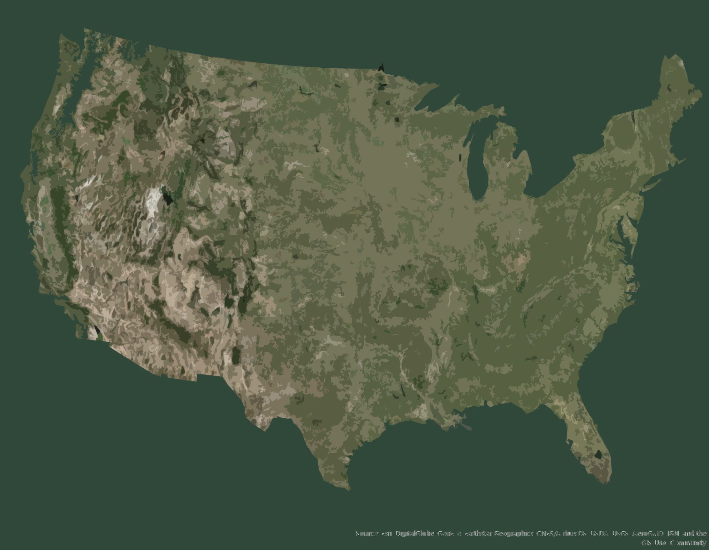
Prepare Basemap in ArcGIS Pro: In a new map in ArcGIS Pro, set the projection to North America Albers Equal Area Conic and the reference scale to 1:16,500,000. Add the World Imagery (Clarity) basemap from ArcGIS Living Atlas. Create a polygon “mask” covering the ocean areas to isolate the landmass.
 Basemap with Ocean Mask in ArcGIS Pro
 -
Export to PDF: Export the map view as a PDF file with a resolution of 175 DPI.
 Exported PDF Basemap
 -
Apply Cutout Filter in Photoshop: Import the PDF into Photoshop. Use the Cutout filter (Filter Gallery > Artistic > Cutout) with settings like:
- Number of Levels: 8
- Edge Simplicity: 5
- Edge Fidelity: 3
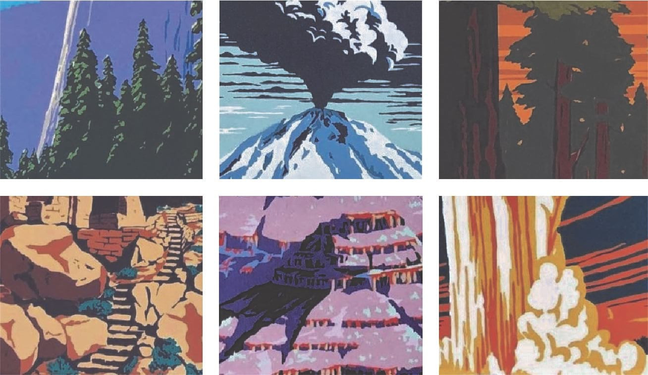 Cutout Filter Settings in Photoshop
 -
Export as GIF: Export the filtered image as a GIF file. While GIF might seem unusual, it often preserves the desired resolution and georeferencing properties better than JPG or PNG in this context.
 Basemap with Cutout Effect
 -
Georeference in ArcGIS Pro: Import the GIF image back into ArcGIS Pro. Use the Georeferencing toolbar to align the GIF image with your US States boundary layer. The “Fit to Display” option can be a good starting point. Add control points, using recognizable geographic features (like state corners), to accurately georeference the image.
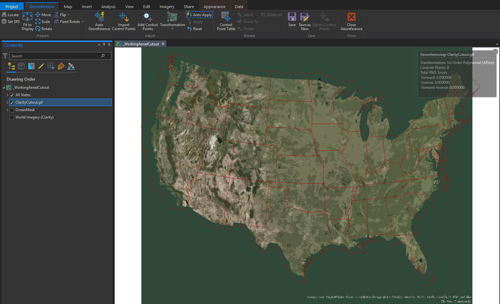 Georeferencing the GIF Image in ArcGIS Pro
Once georeferenced, the cutout effect basemap will overlay correctly with your other GIS layers, creating the desired vintage map look.
Typography and Layout: Bringing the Map to Life
The final step is to bring all the elements together in a map layout and add cartographic refinements. For typography, choose fonts that complement the vintage style. ArcGIS Pro includes fonts like Britannic Bold, Brush Script MT, and Tw Cen MT, which work well for this aesthetic.
Consider these typography and layout elements:
- Title: Use a large, attention-grabbing title in Brush Script MT or a similar vintage-style font. “Where is the Nearest National Park?” is a direct and effective title.
- Subtitles: Use Britannic Bold for subtitles and section headings.
- Map Labels: Label National Parks and major cities using Britannic Bold and Tw Cen MT, respectively, in appropriate sizes and colors that contrast well with the basemap. Convert labels to annotation for manual placement and fine-tuning.
- Legends: Create clear and concise legends for your data layers, using vintage-style fonts and colors.
- Layout Orientation: A portrait layout can mimic the orientation of the WPA posters.
- Multiple Map Frames: Consider using multiple map frames to show insets of Alaska and Hawaii for a complete US view, as the original map did.
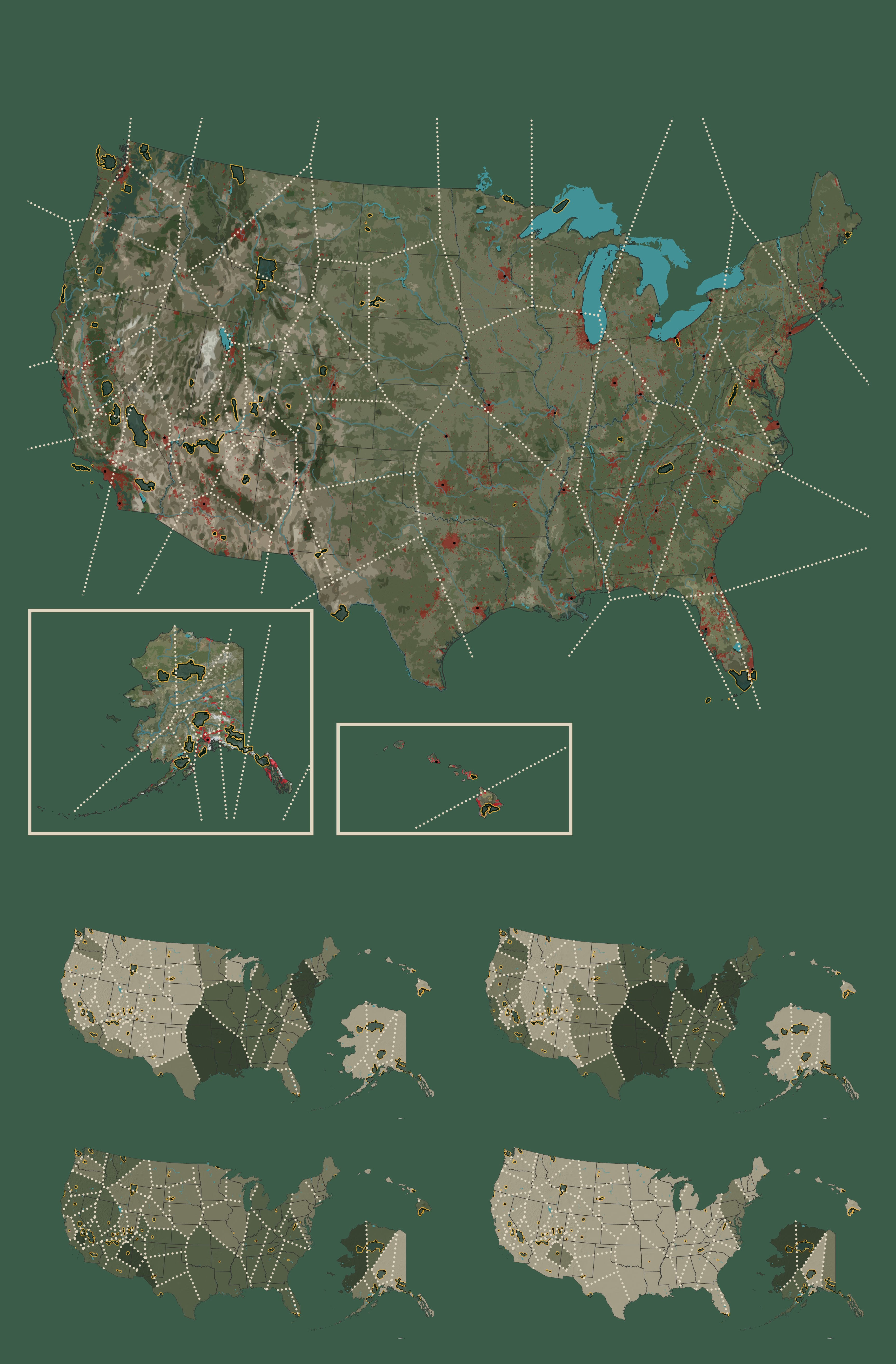 Map Layout with Vintage Typography and Style
Remember to include a disclaimer about the limitations of Thiessen polygons and the purely distance-based nature of “nearest” in this map. Adding a neat line and other cartographic embellishments can further enhance the map’s visual appeal.
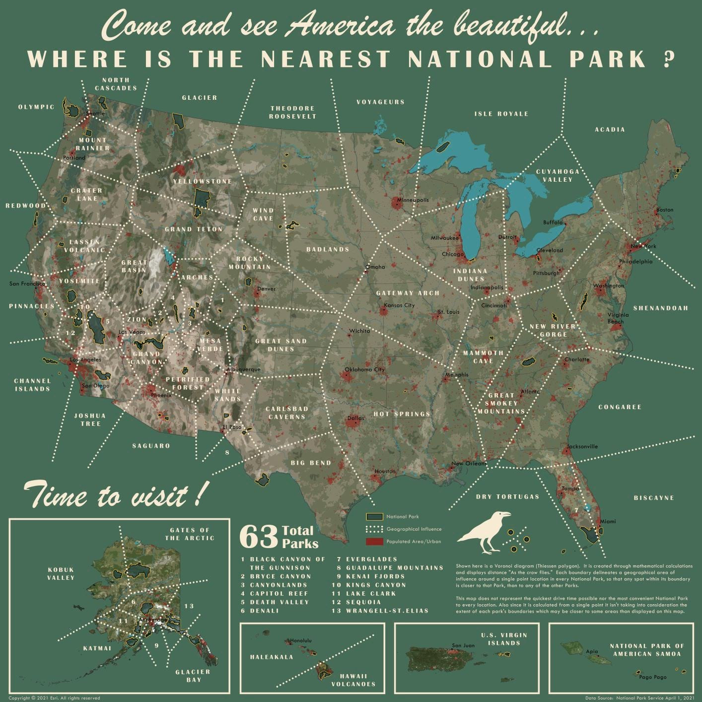
Finding Your Nearest National Park: Using the Map and Exploring Further
With your map complete, you can now answer the question: “Where is the nearest National Park?” By looking at the Thiessen polygons, you can identify which National Park’s area of influence you reside in. This map provides a unique perspective on park proximity and the communities surrounding these natural treasures.
While the map offers a geographical answer, remember that “nearest” is just the starting point. Explore the demographic data you’ve added to understand the context of these areas. Consider the limitations of Thiessen polygons and real-world accessibility factors.
Ultimately, this map is an invitation to explore America’s National Parks. Discover the park nearest to you, and plan a visit to experience the beauty and wonder of these protected landscapes.
2021 Update: Since the original map was created, two new National Parks have been designated: Indiana Dunes and New River Gorge. An updated map, incorporating these new parks and extending coverage to include US Virgin Islands and American Samoa, is available for download, offering an even more comprehensive view of “where is the nearest National Park” across the entire National Park System.
 Updated National Park Map (2021)
This project demonstrates how GIS can be used not only for spatial analysis but also for creating engaging and informative maps that connect people to places and data. So, where is your nearest National Park? Start exploring and discover the natural wonders that await!